We Smell Market Opportunities!!
Altcoin Season Ahead

Key Takeaways
Follow up on Bitcoin Dominance
Inside information on AltCoins
On-Chain Data
In today's edition, and to follow-up on our "BTC dominance" Newsletter from a couple of months ago, we provide you with our view on potential market entry points on Altcoins combining Risk and On-Chain data analysis.
Bitcoin Dominance and Altcoins
The crypto market has risen significantly in the past days/week, adding to the gains made during the latest short squeeze. The market opened at a weekly low of $35,326 and climbed to a high of $42,388 intraday. After months of consolidation and several retests of the $29k key support, this offered some much-needed positive price activity.
To try and understand this price movement, it is important to go through, once again, Bitcoin Dominance. As a small reminder, the most essential aspect of Bitcoin Dominance is that it can assist you in determining whether altcoins are in a downtrend or in an uptrend in comparison to BTC. You can refresh your memory on Bitcoin Dominance by reading our newsletter of Friday July the 2nd HERE.
Below, we will go through the weekly and daily charts of Bitcoin Dominance.
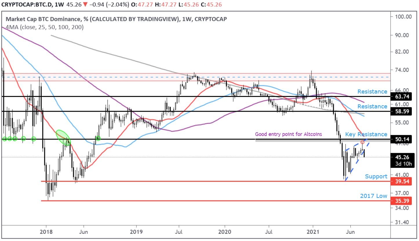
The above weekly chart highlights a multi-year key resistance zone at around 50% for BTC Dominance being rejected. This means BTC Dominance will go test previous support zones, starting with 39% and potentially 35%, which will move money from BTC to Altcoins -> Altcoin Season.
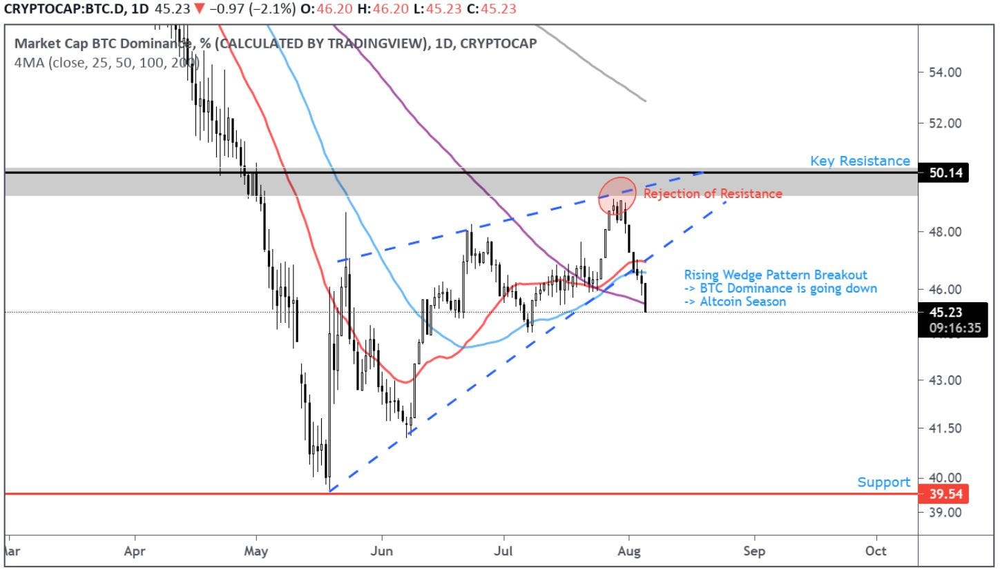
The above daily chart clearly shows a rising wedge pattern which has been broken after testing the multi-year key resistance zone.
Knowing that BTC Dominance is going down and a potential Altcoin season is in play, you should monitor your top altcoin charts for good entry points.
We have identified opportunities on many altcoins ahead of the market, don’t hesitate to contact us through our Website to join our trading signals pack.
On Chain Data
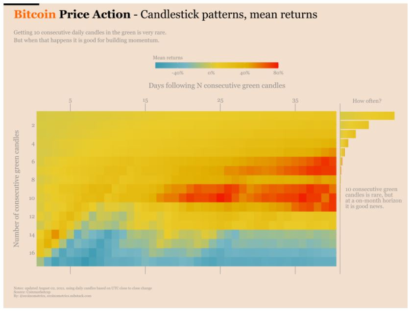
For this week’s on-chain data we are exposing a very interesting view from the Econometrics below.
On the vertical axis you have the number of consecutive green daily candles. E.g. the 10th row means events of 10 consecutive green candles for BTC.
On the horizontal axis you can see the number of days after a given pattern. E.g. the 10th row and the 25th column means what happens 25 days following a pattern of 10 consecutive green candles on BTC.
Each square thus defined gives you the average return D days after the N consecutive candles pattern was observed. E.g. the 10th row and the 25th column means the average return after 25 days following a pattern of 10 consecutive green candles on BTC. Towards the red you get positive returns, and towards the blue you get negative returns.
The size of the bar on the far right represents how often the candlestick pattern is seen.

As you can see with the patches in red, typically 6 to 10 consecutive days of growth are a sign that outsized returns are coming over the next month or so. With all of that being said, there is nothing left to say except that you better buckle your seat belts, and join the Crypto Trading Group Team in this exciting ride!!